Client: Net10
Agency: Hue & Cry
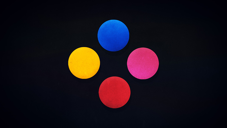
To stand out from all the shiny and technical telecom companies at the time, we went in a direction that felt more human, inviting and simple. The use of elementary colours, lines and a hand drawn style brought across our message that Net10 were accessible and easy.


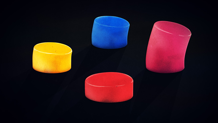
Alternative Ideas